Creating that 1970’s color film print ad look.

I like viewing old magazine ads, fashion, photography, automobile, anything really. I find them very interesting, from the information to the way the photograph looks. Color film in the 60’s and 70’s had this cast on it making it very unique to its time.
I’ve never tried to re-create it from scratch, but now that everything is digital, it is possible to get close results with photoshop tweaking!
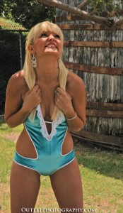
The picture on the left was too underexposed but her fun expression seemed perfect for this 1970’s color magazine ad “look” project.

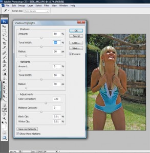
Working with it on Photoshop CS3, I used the Image>Adjustments>Shadow/Highlights panel to adjust the Tonal Width of the image. I also changed the Highlights and Midtone Contrast. I spent some time making all the adjustments, with primarily this panel/feature.
The image on the right shows what the panel looks like before I made the adjustments. If you are using this feature, make that the “show more options” button is checked to see all the possible adjustments, otherwise you will only see the top portion and miss the rest.
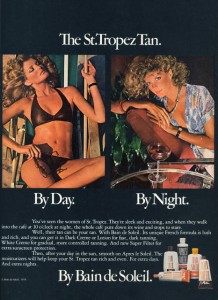
Not sure if I created the exact “look” but I got close. This small adjustment took me no more than 10 minutes. Which is what I normally take when making small corrections or fixes on Photoshop. The last image is a 1976 tanning lotion ad. As you can see it has that look that I was trying to achieve. My image does not have the exact color or style but I think it gets a little close.

Seems like the color in the older print ads had an orange tone to them, like they increased the saturation on the orange/red colors. But I guess its was the type and style of the Kodak film of the time. Even though I used film for at least 10-15 yrs before I switched over to digital, I must admit, I don’t have much knowledge of the film type used in the 1970’s.

